Clutter & Conversion Rate
Background:
We had been working with the client's website for several months prior to this experiment. The landing page was already highly optimized compared to its original version. We had increased the conversion rate 3 different times, simply by reducing the amount of clutter and organizing information in a more clear manner. Although we were happy with how the page was performing, we wanted to see if we could gain yet another boost in conversion with the same technique.
The Experiment:
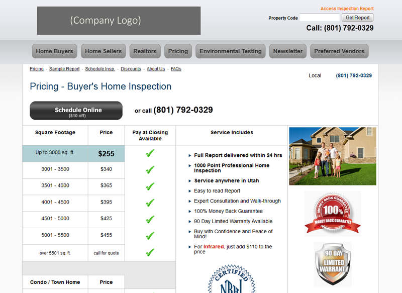
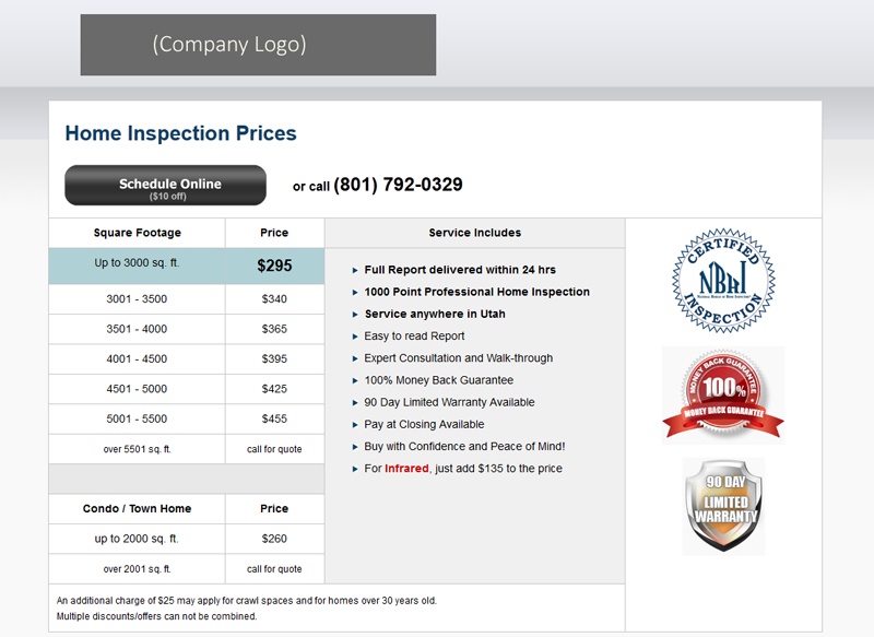
We removed everything that didn't pertain to the customer, including the menu. We didn't need customers to browse around the site, so the menu seemed superfluous. We also removed the photo of a family standing in front of a home. Sure, it looks nice, and all the other companies have pretty stock photos, but it serves no purpose in this case.
The Original Landing Page:
The De-Cluttered Landing Page:
Results:
Original: 12.79%
De-Cluttered: 24.8%
The De-cluttered page had a 93.9% increase in clickthrough rate.
Original: 5.2%
De-Cluttered: 7.8%
The De-cluttered page led to a 50% increase in sales.
Conclusions:
They say a camel is a horse designed by a committee. Don't let your website become a camel. Websites built by committees are generally very cluttered and lack direction. Everyone at the company wants to give their input and feel like they made a meaningful contribution. However, customers don't care about office politics. They want their questions answered in a clear concise manner. The moment you lose sight of your customer, your conversion will suffer.